UI/UX 歴史的事例集UI/UX Historical Case Studies
ギャレットの5レイヤーモデル(戦略・要件・構造・骨格・表層)で歴史的事例を読み解く。Reading historical cases through Garrett's 5-Plane Model (Strategy, Scope, Structure, Skeleton, Surface).
はじめに:5レイヤーと事例の対応関係Introduction: 5 Planes and Their Cases
各事例は複数のレイヤーにまたがるが、最もデザイン判断が集中したレイヤーを主層として分類した。右の「レイヤーマップ」で関与する全層を示す。Each case spans multiple layers, but is classified by the layer where design decisions were most concentrated. The "Layer Map" shows all layers involved.
| レイヤーLayer | 問いQuestion | 代表事例Key Cases | UXへの影響UX Impact |
|---|---|---|---|
| ① 戦略層① Strategy | なぜ作るか?誰のために?Why build it? For whom? | Airbnb / GE MRI / IBM | PMF・共感・組織変革PMF · Empathy · Org. Transformation |
| ② 要件層② Scope | 何を作るか?何を削るか?What to build? What to cut? | GOV.UK / BofA | コンテンツ削減・行動要件Content Reduction · Behavioral Requirements |
| ③ 構造層③ Structure | どう組み立てるか?How to organize it? | Amazon 1-Click / GOV.UK IA | IA・フロー設計IA · Flow Design |
| ④ 骨格層④ Skeleton | どう配置・操作させるか?How to arrange and enable interaction? | iPhone / Material Design | タッチUI・コンポーネントTouch UI · Components |
| ⑤ 表層⑤ Surface | どう見せるか?How should it look and feel? | Macintosh / Google / Material You | 視覚言語・カラー・余白Visual Language · Color · Whitespace |
戦略層の事例Strategy Plane Cases
「なぜ作るか・誰のために作るか」という問いに対してデザインが答えた事例。ユーザーインサイトが事業戦略そのものを変えた瞬間を読む。Cases where design answered the question "Why build this — and for whom?" Moments when user insights transformed business strategy itself.
概念図 ©2026 KAJI
Airbnb, Inc.の商標・著作権は同社に帰属Conceptual diagram ©2026 KAJI
Airbnb, Inc. trademarks/copyrights belong to Airbnb, Inc.
戦略的問いThe Strategic Question
2009年、月収数百ドルで伸び悩むAirbnb。Paul Grahamの「なぜ予約が入らないか」という問いに対し、創業者が現地調査(ニューヨーク)で発見したのは「写真が暗くて信頼できない」という根本原因だった。In 2009, Airbnb was stagnating with monthly revenue of only a few hundred dollars. When Paul Graham asked "why aren't people booking?", the founders went on-site to New York and discovered the root cause: "the photos are dark and untrustworthy."
戦略的介入:スケールしないことをするStrategic Intervention: Do Things That Don't Scale
創業者自らがカメラを持ちホストを訪問。プロカメラマンを手配し物件を撮り直した。これは「スケールしないアクション(do things that don't scale)」だが、翌週のニューヨーク売上が2〜3倍に。The founders personally visited hosts with cameras and arranged professional photographers to reshoot listings. A classic "do things that don't scale" action — but New York revenue doubled or tripled the following week.
戦略層のレッスンStrategy Plane Lessons
- ユーザーリサーチ(現地観察)が戦略の誤りを修正したUser research (on-site observation) corrected a strategic error
- 「サービス品質」の定義をUI改善でなくコンテンツ品質に再定義Redefined "service quality" from UI improvement to content quality
- マーケットプレイスでは供給側(ホスト)のUX改善 = 需要側の体験向上In a marketplace, improving the supply side (host) UX = improving the demand side experience
GE Adventure Series 概念図 ©2026 KAJI
GE HealthCareの商標・著作権は同社に帰属GE Adventure Series conceptual diagram ©2026 KAJI
GE HealthCare trademarks/copyrights belong to GE HealthCare
戦略的問いの転換Shifting the Strategic Question
GEデザイナーDoug Dietzが病院訪問時、MRI前に泣く子どもを目撃。当時の問いは「いかに精度を上げるか」だったが、彼はスタンフォードd.schoolのデザイン思考研修後、問いを「いかに子どもたちにとって怖くない体験にするか」に再定義した。GE designer Doug Dietz witnessed a child crying before an MRI scan. The original question was "how do we improve image quality?" — but after attending Stanford d.school, he reframed it: "how do we make this a non-scary experience for children?"
共感フェーズ(Empathize)Empathy Phase
- 子どもへのインタビュー:「宇宙・海・ジャングルの冒険」が好きだと判明Child interviews revealed they love "space, ocean, and jungle adventures"
- MRI機械を「海賊船」「宇宙船」「密林探検の乗り物」として再デザインMRI machines redesigned as "pirate ships," "spaceships," and "jungle expedition vehicles"
- 部屋全体・床・天井・壁・スタッフのセリフまでをシステムとして設計The entire room — floor, ceiling, walls, and staff scripts — designed as a holistic system
成果Results
Pittsburgh子ども病院での鎮静剤投与率が大幅低下。患者満足度がトップ評価へ。病院の収益性も改善(鎮静処置コスト削減)。Sedation rates at Pittsburgh Children's Hospital dropped dramatically. Patient satisfaction reached top ratings. Hospital profitability improved through reduced sedation procedure costs.
IBM Enterprise Design Thinking
概念図 ©2026 KAJI
IBM Corporationの商標・著作権は同社に帰属IBM Enterprise Design Thinking
Conceptual diagram ©2026 KAJI
IBM Corporation trademarks/copyrights belong to IBM
戦略的背景Strategic Background
2013年、IBMはクラウド・AI時代への転換を迫られていた。CEO ジニ・ロメッティは「デザイン主導の会社に変わる」と宣言し、Phil Gilbertを統括として全社的デザイン変革を開始。In 2013, IBM was under pressure to transition into the cloud and AI era. CEO Ginni Rometty declared "we will become a design-led company" and appointed Phil Gilbert to lead a company-wide design transformation.
IBM独自のDesign ThinkingフレームワークIBM's Custom Design Thinking Framework
- Hills:「誰が・何を・なぜ」でチームの目指す山を定義。ビジネス目標ではなくユーザー成果で語るHills: Define the team's target mountain with "who, what, why." Framed as user outcomes, not business goals
- Playbacks:定期的に現在地をステークホルダーに見せるフィードバックループPlaybacks: Regular feedback loops showing current state to stakeholders
- Sponsor Users:実際のユーザーを開発チームメンバーとして参加させる仕組みSponsor Users: A mechanism for including real users as development team members
成果Results
- デザイナー採用:100人→1,500人以上(5年間)Designer hiring: 100 → 1,500+ over 5 years
- Forrester Research(2018):投資$1あたり$3のROIForrester Research (2018): $3 ROI per $1 invested
- 製品開発サイクルが平均33%短縮Product development cycle shortened by an average of 33%
要件層の事例Scope Plane Cases
「何を作るか・何を削るか」を決断したデザイン。コンテンツ要件の再定義と行動インサイトが要件を変えた事例。Design decisions about what to build — and what to cut. Cases where redefining content requirements and behavioral insights transformed scope.
GOV.UK スタイル 概念図 ©2026 KAJI
実際のUI: Open Government Licence(英国政府)GOV.UK style conceptual diagram ©2026 KAJI
Actual UI: Open Government Licence (UK Government)
要件定義の問いThe Scope Definition Question
2011年、英国の政府Webサイトは750以上が乱立。GDS(Government Digital Service)の問いは「市民が本当に必要とするコンテンツとは何か」。ユーザー調査から「コンテンツの85%はユーザーが必要としていない」という結論を導いた。In 2011, over 750 UK government websites sprawled in chaos. The GDS (Government Digital Service) asked: "what content do citizens actually need?" User research concluded that 85% of content was not needed by users.
要件削減のアプローチApproach to Reducing Scope
- ニーズドリブン要件定義:「政府が伝えたいこと」でなく「市民がやりたいタスク」で要件を再定義Needs-Driven Scope: Requirements redefined by "tasks citizens want to do," not "what government wants to communicate"
- コンテンツオーディット:全ページを有用性・正確性・必要性で評価し大量削除Content Audit: Every page evaluated for usefulness, accuracy, and necessity — with mass deletion
- Plain English原則:専門用語を排除。読了時間を平均65%短縮Plain English Principle: Jargon eliminated. Average reading time reduced by 65%
- User Story駆動:「市民として、パスポートを申請できるようにしたい」など実タスクから要件化User Story-Driven: Requirements derived from real tasks like "As a citizen, I want to apply for a passport"
Keep the Change 概念図 ©2026 KAJI
Bank of AmericaおよびIDEOの商標・著作権は各社に帰属Keep the Change conceptual diagram ©2026 KAJI
Bank of America and IDEO trademarks/copyrights belong to their respective companies
リサーチが機能要件を生んだプロセスHow Research Created Functional Requirements
IDEOがBank of Americaと共同で「なぜ人は貯金できないのか」を調査。エスノグラフィー調査で「多くの人がお釣りをジャーに貯める」という行動パターンを発見。この観察が直接、機能要件「支払いを1ドル単位に切り上げて差額を積立」に変換された。IDEO collaborated with Bank of America to investigate "why can't people save money?" Ethnographic research uncovered a behavioral pattern: many people save their change in jars. This observation directly translated into the functional requirement: "round up purchases to the nearest dollar and save the difference."
要件設計のポイントKey Points of Scope Design
- デフォルト効果:オプトインでなくデフォルトON。意思決定コストをゼロにDefault Effect: Default ON, not opt-in. Decision-making cost reduced to zero
- 見えない摩擦:支払い行動を変えずに貯蓄を実現。UX上の負担ゼロInvisible Friction: Saving achieved without changing payment behavior. Zero UX burden
- 進捗の可視化:「今日いくら貯まった」をアプリで表示し動機を維持Progress Visibility: App displays "how much saved today" to sustain motivation
構造層の事例Structure Plane Cases
情報の組み立て方・インタラクションフローの設計が体験を決定した事例。IAとフロー設計の力。Cases where how information was organized and interaction flow was designed determined the experience. The power of IA and flow design.
Amazon 1-Click 概念図 ©2026 KAJI
Amazon.comの商標・著作権は同社に帰属Amazon 1-Click conceptual diagram ©2026 KAJI
Amazon.com trademarks/copyrights belong to Amazon
構造的問題:購入フローの離脱Structural Problem: Purchase Flow Abandonment
1990年代のECサイトは住所入力→クレジットカード入力→確認→完了という複数ステップが標準。各ステップが離脱ポイントとなる「カゴ落ち」問題を抱えていた。Amazonは「購入の意思決定後の摩擦をゼロにする」という構造的解法を選択。In the 1990s, e-commerce checkout had multiple steps: enter address → credit card → confirm → done. Each step was a drop-off point in the "cart abandonment" problem. Amazon chose a structural solution: "eliminate all friction after the purchase decision."
1-Clickの構造設計1-Click's Structural Design
- 配送先・支払情報を事前登録し「ボタン1つ」に圧縮Shipping and payment info pre-registered, compressed to "one button"
- 購入後30分以内はキャンセル可能(エラー回復の設計)Cancellable within 30 minutes of purchase (error recovery design)
- 「購入確認ページ」を廃止——これが最大の構造的革新"Purchase confirmation page" eliminated — the biggest structural innovation
骨格層の事例Skeleton Plane Cases
インターフェースの配置・コンポーネント設計・操作設計が体験の使いやすさを決定した事例。Cases where interface layout, component design, and interaction design determined the usability of the experience.
iPhone vs 物理キーボード 概念図 ©2026 KAJI
Appleの商標・著作権は同社に帰属iPhone vs physical keyboard conceptual diagram ©2026 KAJI
Apple trademarks/copyrights belong to Apple Inc.
骨格設計の革新Skeleton Design Innovation
BlackBerryなど従来のスマートフォンは物理キーボードが常時画面の半分を占有。iPhoneは「キーボードは必要なときだけ表示する」というインターフェース骨格の転換により、全画面をコンテキストに応じた操作エリアとして使えるようにした。Conventional smartphones like BlackBerry had a physical keyboard permanently occupying half the screen. The iPhone made a skeleton-level shift: "show the keyboard only when needed" — making the entire screen available as a context-sensitive interaction area.
骨格設計のポイントKey Points of Skeleton Design
- コンテキスト適応UI:テキスト入力時のみキーボード表示。写真閲覧時は全画面Context-Adaptive UI: Keyboard shown only during text input. Full screen during photo viewing
- 慣性スクロール:指を離した後も物理法則に従い減速。「物質感」をUIにInertial Scrolling: Continues to decelerate following physical laws after finger lifts. Brings "physicality" to UI
- ホームボタン1つ原則:どこからでも戻れる「脱出口」。迷子にならない設計Single Home Button Principle: An "escape hatch" back from anywhere. Design that prevents getting lost
- 44pt タッチターゲット:指での正確な操作を保証する最小サイズの確立44pt Touch Target: Establishing the minimum size to guarantee accurate finger interaction
表層の事例Surface Plane Cases
ユーザーが最初に触れる視覚・感覚の層。色・タイポグラフィ・余白・モーションが信頼と感情を生んだ事例。The visual and sensory layer users first encounter. Cases where color, typography, whitespace, and motion created trust and emotion.
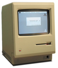
Apple Macintosh 128K
© Wikimedia Commons / CC BY-SA 2.5
デスクトップメタファーUIの商業的起源Apple Macintosh 128K
© Wikimedia Commons / CC BY-SA 2.5
Commercial origin of the desktop metaphor UI
表層デザインの革新Surface Design Innovation
Macintoshは「現実世界のメタファーをピクセルで再現」する表層デザインを確立。ゴミ箱・フォルダ・書類という視覚的比喩が、コンピュータを初めて触る人々に操作可能性(アフォーダンス)を伝えた。The Macintosh established surface design by "recreating real-world metaphors in pixels." Visual metaphors — trash can, folder, document — communicated affordances to people touching a computer for the very first time.
表層設計のポイントKey Points of Surface Design
- スキューモーフィズム:物質的質感(紙・皮・木)のビジュアル表現でデジタルを親しみやすくSkeuomorphism: Visual representation of material textures (paper, leather, wood) makes digital feel familiar
- ビットマップフォント:Susan Kareによるシカゴ体等。画面での可読性を追求した最初の試みBitmap Fonts: Chicago and others by Susan Kare. The first pursuit of on-screen legibility
- アイコンデザイン:Susan Kareが設計した絵文字的アイコンが「視覚的ショートカット」を実現Icon Design: Pictographic icons designed by Susan Kare created "visual shortcuts"
- 白黒2値の美学:限られたディスプレイ解像度の制約を逆手に取ったミニマルな美しさBlack-and-White Aesthetic: Minimal beauty that turned limited display resolution into an advantage
Google 検索 概念図(SVG再現)
実際のUI著作権はGoogle LLCGoogle Search conceptual diagram (SVG recreation)
Actual UI copyright belongs to Google LLC
表層としての「何もない」The Surface of "Nothing"
1998年当時のポータルサイト(Yahoo!・Excite・Lycos)は広告・ニュース・リンクが画面を埋める「情報密度の高さ」を競っていた。Googleは真逆の表層設計——白いページにロゴと検索ボックスだけ——を選択した。In 1998, portal sites (Yahoo!, Excite, Lycos) competed on "information density" — ads, news, and links filling every pixel. Google took the opposite surface approach: a white page with just a logo and a search box.
表層設計の意味The Meaning of Surface Design
- 視線の誘導:余白が「次にすること(検索ボックスに入力する)」を自明にするGaze Guidance: Whitespace makes the next action ("type in the search box") self-evident
- 認知負荷ゼロ:選択肢を持たないUIは意思決定コストがないZero Cognitive Load: A UI with no choices has no decision-making cost
- 速度のUX:ページ重量を数KBに抑えた表層設計が「速さ」という体験を生むSpeed as UX: Surface design that keeps page weight to a few KB creates the experience of "speed"
- Googleカラーの戦略的遊び:ロゴの4色は「遊び心・多様性」を単色の企業らしさに優先させたGoogle's Strategic Color Play: The logo's 4 colors prioritized "playfulness and diversity" over monochrome corporate identity
Material You Dynamic Color 概念図
実際のUI著作権はGoogle LLCMaterial You Dynamic Color conceptual diagram
Actual UI copyright belongs to Google LLC
表層の「パーソナライズ革命」Surface's 'Personalization Revolution'
Material Design 3(Material You、2021)は「ユーザーの壁紙1枚からアプリ全体の配色を動的に生成する」という表層設計の革新。Material Color Utilityがシードカラーを分析し、コントラスト比・アクセシビリティを保ちながら自動的にカラースキームを構築する。Material Design 3 (Material You, 2021) is a surface design innovation: "dynamically generate the entire app color scheme from a single user wallpaper." Material Color Utility analyzes the seed color and automatically builds a color scheme while maintaining contrast ratio and accessibility.
表層設計のポイントKey Points of Surface Design
- Dynamic Color:Primary・Secondary・Tertiary・Error・Neutralの6ロールをアルゴリズムで生成Dynamic Color: 6 color roles — Primary, Secondary, Tertiary, Error, Neutral — generated algorithmically
- トーンベースの設計:明度(Tone 0〜100)と彩度(Chroma)の関係でコントラストを制御Tone-Based Design: Contrast controlled through the relationship between lightness (Tone 0–100) and saturation (Chroma)
- アクセシビリティ担保:自動生成されるカラーもWCAG AA基準を満たすよう設計Accessibility Guarantee: Auto-generated colors designed to meet WCAG AA standards
- 感情的パーソナライズ:「自分の色」が使われることで所有感・愛着を生むEmotional Personalization: Using "your colors" creates a sense of ownership and attachment
事例 × レイヤー マトリクスCase × Layer Matrix
◎ 主層 ○ 副層 — 関与なし◎ Primary ○ Secondary — Not involved
| 事例Case | 戦略層Strategy | 要件層Scope | 構造層Structure | 骨格層Skeleton | 表層Surface |
|---|---|---|---|---|---|
| Airbnb 写真戦略Airbnb Photo Strategy | ◎ ユーザーニーズ再定義◎ User Needs Redef. | — | — | — | ○ 写真品質○ Photo Quality |
| GE MRI for KidsGE MRI for Kids | ◎ 問いの再定義◎ Question Reframe | — | ○ 体験フロー○ Experience Flow | — | ○ 空間デザイン○ Spatial Design |
| IBM Design ThinkingIBM Design Thinking | ◎ 組織変革◎ Org. Transformation | ○ Hills定義○ Hills Definition | — | — | — |
| GOV.UKGOV.UK | ○ ユーザーニーズ優先○ User Needs First | ◎ コンテンツ85%削減◎ 85% Content Cut | ○ タスクベースIA○ Task-Based IA | — | — |
| BofA Keep the ChangeBofA Keep the Change | ○ 行動インサイト発見○ Behavioral Insight | ◎ ナッジ機能要件◎ Nudge Requirements | — | ○ 切り上げUI○ Round-Up UI | — |
| Amazon 1-ClickAmazon 1-Click | — | ○ 確認ステップ削除○ Confirm Step Removed | ◎ 購入フロー再設計◎ Purchase Flow Redesign | ○ ボタン配置○ Button Placement | — |
| iPhone(初代)iPhone (1st Gen) | ○ 電話再発明○ Phone Reinvented | — | — | ◎ タッチUI骨格◎ Touch UI Skeleton | ○ アイコン・モーション○ Icons & Motion |
| Apple MacintoshApple Macintosh | ○ 人間のためのPC○ PC for Everyone | — | ○ デスクトップIA○ Desktop IA | — | ◎ 視覚言語・アイコン◎ Visual Language & Icons |
| Google 検索Google Search | — | ○ 要素の排除○ Element Elimination | — | — | ◎ 余白・シンプルさ◎ Whitespace & Simplicity |
| Material You(M3)Material You (M3) | ○ Personal原則○ Personal Principle | — | — | — | ◎ Dynamic Color◎ Dynamic Color |